I'm going to tell you about 2 tools for art and craft that I've found useful. Each one works great but together they can be even better.
Tool one: the Color Cube
I've admired the Color Cube for a long time. The palettes are beautifully curated and the design is the kind of thing that makes you want to sit down and color before you've even picked a card. I get why people love it.
I also never bought one. Honestly, the price was more than I could justify for a hobby budget, and that's okay — a lot of good tools are.
But owning it or not, I kept running into the same wall, and it wasn't about the Cube at all.
The real challenge was the pile on my desk.
The pile on my desk
I'd find a palette I loved — on a Color Cube card someone shared online, or a Pinterest photo, or a tutorial screenshot — and then look at the hundred-plus pencils in my tray and think: *okay, which ones?*
I'm a papercrafter. On any given Saturday my desk has colored pencils out, markers out, ink pads out, sometimes watercolors, sometimes all four at once. A single card project might use Altenew Markers for the florals, Faber-Castell Polychromos for details, watercolor or inks for the stamping and background.
So the question wasn't just "which pink" — it was which Altenew Marker pink, which Polychromos pink, and does the ink already on my desk match or do I need to mix?
Thirty minutes of swatching later I'd have a page of color smudges, a cold cup of tea, and zero cardstock touched. The prep had eaten the project.
What I built
I wanted to point at a palette — any palette, a card someone shared, a photo I saved, anything — and be told in plain English: *the closest Altenew Marker is Coral Berry. The closest Polychromos is 124 Rose Carmine. The closest watercolor is Daniel Smith Quinacridone Rose.* Across brands. At the same time. In under a minute.
That tool didn't exist. So I built one.
A shortcut for Color Cube owners
If you do own a Color Cube, here's something I'd try if I were you: snapshot the card, upload it to MyKindofColor, and let the app find matches across every brand you own. You get to keep the palette you love and skip the swatching.
Sarah curated the palette. The app translates it into your supply drawer.
A walk-through with tulips
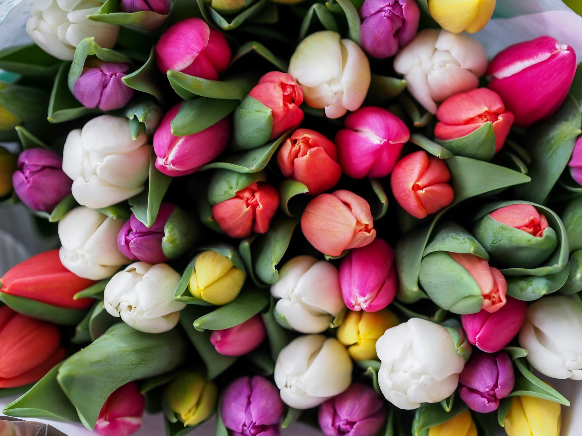
A vibrant tulip bouquet — exactly the kind of photo artists save on Pinterest for color inspiration.
It works the same way with any photo. I saved this tulip bouquet on Pinterest one evening — wide-open pinks, a couple of deep corals, a soft olive in the stems, one warm yellow peeking through.
Dropped it into the app:
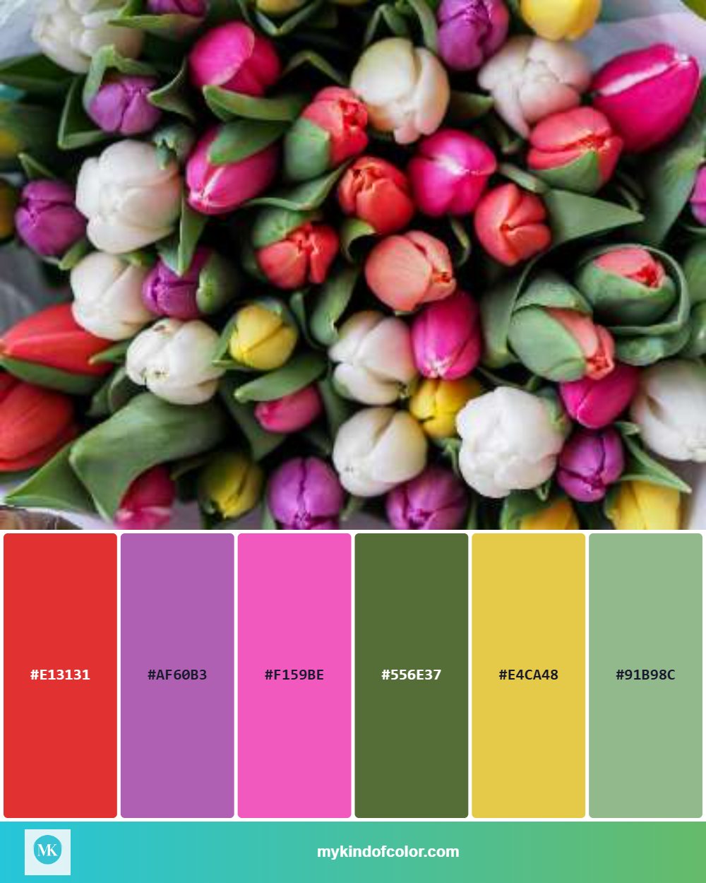
Six colors, cleanly pulled — ready to match to real art supplies.
Six colors, cleanly pulled. But hex codes aren't the point — what comes next is:
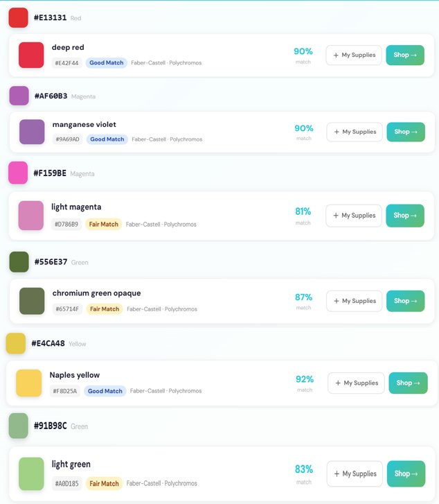
Real results: Faber-Castell Polychromos matches for the tulip palette, each with a match quality rating and percentage.
The Polychromos matches, pulled using Delta E 2000 color science (the same math paint manufacturers use to match a swatch to a gallon). Each one comes with a quality rating — "Excellent" means your eye won't clock the difference from the original.
I can swap to Altenew Markers and see which I already own. Or to watercolors and see tube matches. Or see all three at once, because that's the project I'm actually making.
The feeling I wanted to protect
Saturday morning. Clean desk. Tea that's still warm. A palette, a photo, a plan. Supplies already in my tray, ready to go.
Not forty swatches. Not a cold cup. Not thirty minutes gone before the first color hits paper.
You don't need to swatch everything you own. Pick the ones closest to the chips. Warm colors are forgiving. Start.
This is your hour. This is the point of the hobby.
Try it with whatever's on your desk
Head to mykindofcolor.com, drop in a photo — or a snapshot of a palette card you love — and see what matches. Free to try, no account needed. Easy peasy lemon-squeezy.