There's a moment every cardmaker knows — you're staring at a gorgeous floral reference photo, and you're thinking: *which inks do I reach for?*
That soft blush in the petals — is it Pink Diamond or Pinkalicious? And the leaves — do I need Shadow Creek or Mountain Pine? When you're standing at your craft table with 50+ ink pads, even knowing which *family* to grab can feel like a puzzle.
So I did what I always do now: I uploaded my reference photo to MyKindofColor and let the color science answer for me.
The Reference Photo
A lush pink peony against deep green foliage — the kind of image that makes your hands itch for your blending brushes. That contrast between the rich, shadowy greens and the soft-to-bold pinks is exactly the kind of palette that translates beautifully to a stamped card.
The Extracted Palette
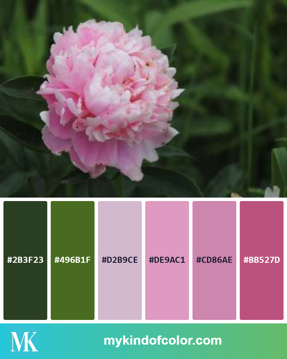
A gorgeous pink and green palette using one of my photo inspirations
MyKindofColor pulled six colors from the photo:
| Swatch | Hex Code | What I See |
|--------|----------|------------|
| 🟩 | #2B3F23 | Dark forest green — the deepest shadows in the leaves |
| 🟢 | #496B1F | Warm olive green — where the sunlight hits the foliage |
| 🌸 | #D2B9CE | Soft lavender-pink — the lightest petal edges |
| 💗 | #DE9AC1 | Rose pink — the mid-tone glow of the bloom |
| 🌸 | #CD86AE | Warm medium pink — where the petals gather |
| 💗 | #BB527D | Deep pink — the shadows where petals fold |
The Altenew Ink Matches
Here's the part that made me smile. When I looked at the palette, I already knew exactly which ink families this was calling for — because these are two sets I reach for constantly: Cherry Blossom and Green Valley.
For the petals — Cherry Blossom Fresh Dye Ink:
The Cherry Blossom set runs light to dark: Pink Diamond → Pinkalicious → Rubellite → Razzleberry. That's exactly how this peony palette flows.
For the leaves — Green Valley Fresh Dye Ink:
The Green Valley set runs: Firefly → Grass Field → Shadow Creek → Mountain Pine. My palette pulled the two deeper greens.
If you want more dimension, start your lightest leaves with Grass Field and build down from there. The full Green Valley range gives you everything you need for believable foliage.
The Card I Made
For my AECP Level 3 final course — Jaycee Gaspar's Elements of Floral Composition class — I used exactly this combination to create a card with Altenew's Branching Roses. I stamped the images on white cardstock and colored with Cherry Blossom and Green Valley inks using mini blending brushes (they're a delight to work with). The images were die cut and layered over a pink watercolor background with the trellis die. The sentiment was cut from Altenew's Black Diamond Glitter cardstock using the XOXO die set.
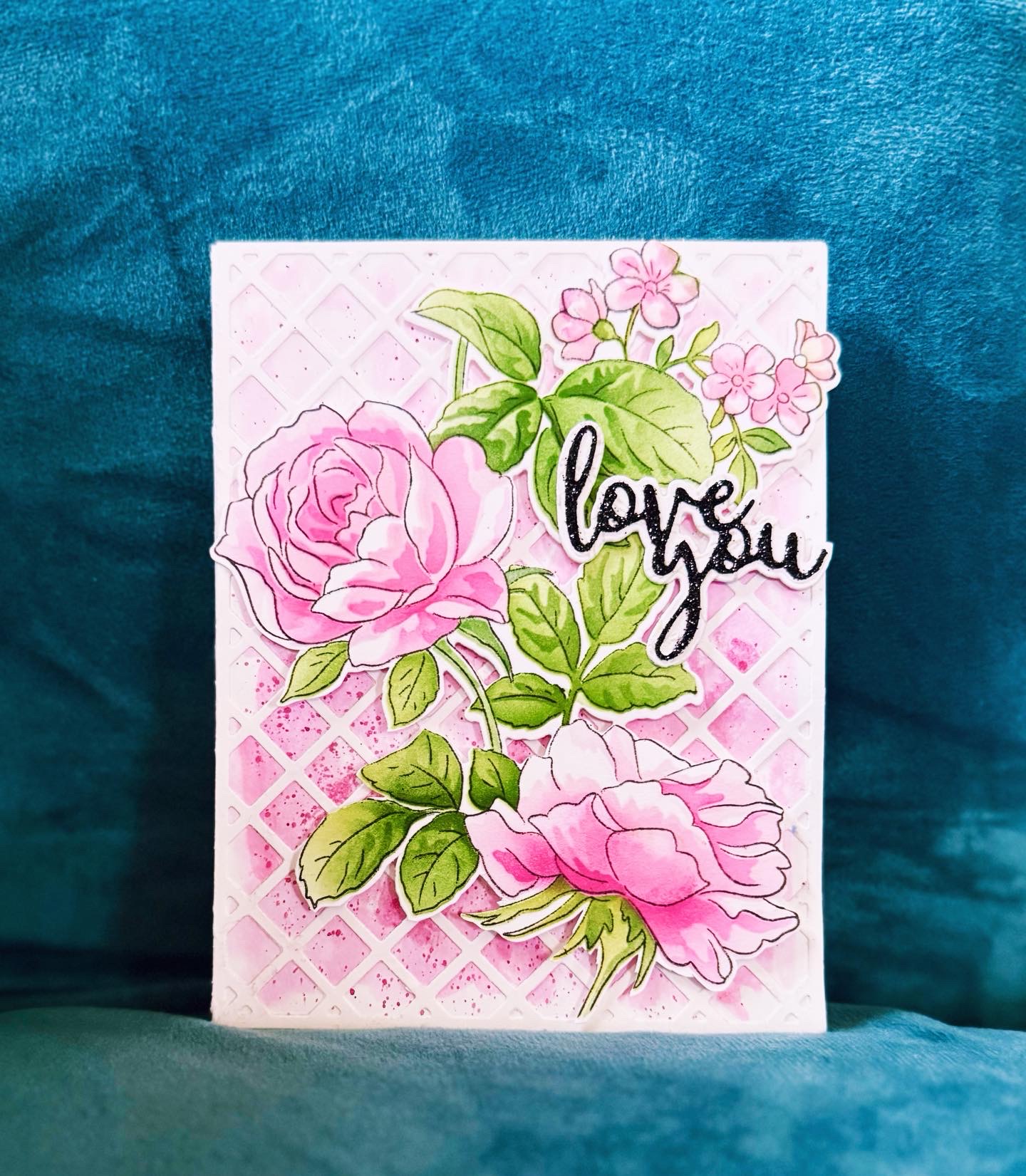
A love you card using the peony colors for rose branch
The card came together quickly because I wasn't guessing about color. The palette told me exactly what I needed, and the inks delivered.
Why This Matters
Here's the thing about layered stamping: the difference between a card that looks "nice" and one that looks *elegant* often comes down to whether your colors are working together harmoniously. When your inks match the values and tones of your reference image, the result looks intentional. Effortless. Like the colors were made for each other.
That's what a palette does — it takes the guesswork out of the equation so you can focus on the fun part: actually making the card.
Your Turn
Upload any reference photo to MyKindofColor — it's free to start. Extract your palette, see the hex codes, and match them to the Altenew inks (or colored pencils, or markers) you already own. No more second-guessing at the craft table.
Your photo. Your brands. The exact match.
---
Supplies used in this post:
Written by an Altenew Certified Educator (AECP Level 3)
Here’s something to get you started:
Five Free palettes and their closest matches in your brand.
Five palettes I keep reaching for, paired with the closest matches in your brand. Pick one, pour tea, and start.
Free to try, no account needed. We'll only email you about the palettes you ask for.