You've probably noticed that some color combinations just *feel* right, and others feel like they're fighting each other. That's not an accident — there's a simple structure underneath, and once you see it, you see it everywhere.
This is the short version of what that structure is, and how to use it.
The Color Wheel
The color wheel is your most important tool. It organizes colors in a circle, showing relationships between them:
Primary Colors: Red, Yellow, Blue - These cannot be created by mixing other colors.
Secondary Colors: Orange, Green, Violet - Created by mixing two primary colors.
Tertiary Colors: Red-Orange, Yellow-Orange, Yellow-Green, etc. - Created by mixing a primary with an adjacent secondary.
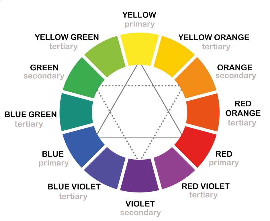
The Color Wheel
Color Harmonies
Color harmonies are pleasing arrangements of colors based on their position on the wheel:
Temperature
Colors are also categorized by temperature:
Understanding temperature helps create depth and mood in your work.
Here’s something to get you started:
Five Free palettes and their closest matches in your brand.
Five palettes I keep reaching for, paired with the closest matches in your brand. Pick one, pour tea, and start.
Free to try, no account needed. We'll only email you about the palettes you ask for.