If you've ever tried to follow a tutorial designed for Copic markers using Prismacolor pencils — or vice versa — you know the struggle. Every brand uses a completely different numbering system, and names like "Light Cerulean Blue" and "Ice Blue" tell you almost nothing about whether two colors from different brands actually look the same on paper.
This guide breaks down how color systems work across the three most popular art supply brands, gives you a practical conversion reference, and shows you how to match colors automatically using modern tools.
Why Color Matching Across Brands Is So Hard
The core issue is that there's no universal color standard in the art supply industry. Each manufacturer develops their own pigment formulations, their own naming conventions, and their own numbering systems.
Prismacolor Premier Colored Pencils use a "PC" prefix followed by a number. The numbers don't follow any logical color order — PC901 is Indigo Blue, PC903 is True Blue, but PC902 is Ultramarine. There are 150 pencils in the full range, and the only way to know what number corresponds to what color is to look it up.
Copic Markers use an alphanumeric code that's actually more systematic. The first one or two letters indicate the color family (R = Red, BV = Blue Violet, E = Earth, Y = Yellow, etc.), the first digit indicates saturation (lower = more saturated), and the second digit indicates brightness (lower = brighter). So RV34 is a specific Red Violet: medium saturation, medium brightness. It's logical once you learn it, but it's a completely different system from Prismacolor.
Faber-Castell Polychromos use three-digit numbers that roughly group by color family, along with descriptive German-influenced names. Number 110 is Phthalo Blue, 120 is Ultramarine, 151 is Helioblue-Reddish. The numbering has a loose spectral order, but gaps and inconsistencies make it unreliable for guessing.
The result: if an artist says "use PC1034, E13, and 187," only someone who owns all three brands would immediately know those are three different takes on warm yellow-brown tones. Everyone else has to look it up.
How Professional Color Matching Actually Works
In industries like paint manufacturing, printing, and textile production, color matching doesn't rely on names or numbers at all. Instead, every color is defined as a precise point in a mathematical color space.
The most common standard is CIELAB (L*a*b*), which was designed to map human color perception. Every visible color gets three coordinates:
When you want to know how similar two colors are, you calculate the Delta E between their L*a*b* coordinates. The most accurate version of this formula is Delta E 2000 (ΔE00), which accounts for quirks in human perception — like the fact that we're more sensitive to differences in certain hue ranges than others.
This is how MyKindofColor matches art supplies: by comparing actual color values, not names or numbers.
Matching Colors Automatically
There are thousands of possible cross-brand combinations, and a static chart can't cover them all.
For dynamic matching — where you can upload any photo, any screenshot, or any color hex code and instantly see the closest match across every supported brand — try MyKindofColor.
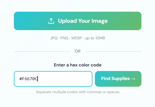
You can match colors by uploading a photo OR by typing any hex code directly — perfect for matching colors you find online.
The tool uses Delta E 2000 color science to compare your input colors against a database of over 3,600 individual art supplies, including the full ranges for all three brands in this guide plus Holbein, Derwent, Caran d'Ache, Winsor & Newton, Daniel Smith, Altenew, Tim Holtz, Sennelier, and more.
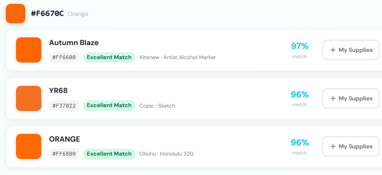
One hex code, matches across multiple brands instantly — Altenew, Copic, and Ohuhu all returning Excellent Match results for the same orange.
It's free to use and doesn't require creating an account for basic matching.
Quick Reference: Brand Numbering Systems
For when you encounter an unfamiliar code and just need to decode it:
Bookmark This and Start Matching
The next time you hit a tutorial that uses a brand you don't own, come back to this guide for a quick reference — or upload a screenshot to MyKindofColor for an instant conversion across all supported brands.
No more guessing, no more buying duplicate supplies, no more skipping tutorials because you own the "wrong" brand.
---
Want us to add a brand or product line to the database? Email us at mykindofcolorteam@gmail.com — we add new colors regularly based on community requests.
Here’s something to get you started:
Five Free palettes and their closest matches in your brand.
Five palettes I keep reaching for, paired with the closest matches in your brand. Pick one, pour tea, and start.
Free to try, no account needed. We'll only email you about the palettes you ask for.